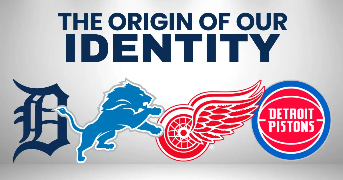
Detroit’s Logos Aren’t Just Branding — They’re Identity
Not too long ago, I found myself thinking about a belt I made back in junior high. And no—this wasn’t some slap-together craft project. I took a leather-crafting class and hand-made the entire thing from scratch, carving and painting NHL logos all the way around. Every team. Every logo. I was ridiculously proud of that belt. It was a legit piece of art.
Not long ago, I asked my dad if he had any idea where it ended up.
He didn’t.
And just like that, it was gone.
But I remember exactly what was on it — including the crown jewel.
Right there on that belt was the Winged Wheel — the best logo in hockey, and maybe the best logo in all of sports, period.
That memory stuck with me. And it got me thinking.
I’ve always loved the logos we wear here in Detroit. For me, the order’s never really changed: Wings, Tigers, Lions, Pistons. And really, it’s a tie between the Wings and Tigers.
Speaking of the Pistons — my son just bought a teal throwback jersey. The kids love those things. Me? I’ll admit they’ve grown on me over time… but when you strip it all down, the Pistons’ identity, to me, is still red, white, and blue. Always has been.
And if you’ve spent any time in this city, you know how these conversations go. At the bar. At a backyard BBQ. Sitting in the stands before a game even starts.
“What’s the best logo?”
“Why did they ever mess with that one?”
“Bring that version back.”
So I finally did what we always say we’re going to do — I looked into it.
Where did Detroit’s logos come from?
Who designed them?
And why do some changes stick… while others never really feel like us?
Because here, logos aren’t just branding.
They’re identity.
The Detroit Tigers: A City That Can Spot a Decade by a Letter
The Old English D is one of the most recognizable symbols in American sports — and quietly, one of the most complicated.
It first appeared in 1896, back when the Tigers were still a minor-league club. There was no ad agency, no branding firm. Research from sports design historians shows the letterform was likely lifted straight from the masthead of the Detroit Free Press. It was simply the typography of the city at the time.
And here’s the thing most outsiders don’t realize:
For decades, Detroit fans could identify Tigers eras by the D alone.
The cap D and the jersey D weren’t the same.
Ever.
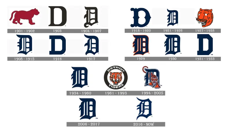
The cap D was more fluid and rounded, with what fans called the “wolf’s mouth” opening. The jersey D was stiffer, more Gothic, heavier. Al Kaline wore one. Ty Cobb wore another. And Detroit fans knew the difference instantly.
What made the Tigers different wasn’t constant redesign — it was subtle evolution. Over the decades, the Old English D quietly changed in small ways: the thickness of the strokes, the sharpness of the serifs, the size of the opening in the letter. Nothing dramatic. Nothing announced. But enough that Detroit fans internalized it.
That’s why reactions to logo changes here are so visceral. Fans may not know typography terms, but they know when the D doesn’t feel right. What looks like a minor tweak elsewhere hits memory in Detroit — because the Old English D isn’t just a logo. It’s muscle memory.
That’s rare. Most cities can’t do that.
So when the Tigers “cleaned up” the look in 2018 by putting the cap D on the jersey, the backlash was immediate. It wasn’t about aesthetics — it was about memory. Detroit knew something had shifted.
The team quietly adjusted again later, but the message was clear:
Don’t mess with the D.
Pop Culture Moment: The Old English D Goes Hollywood
The Old English D might be the most recognizable baseball logo in American pop culture. It famously appeared on Magnum P.I., worn by Tom Selleck throughout the series — an ironic twist, considering the show was set in Hawaii, not Detroit. Over the decades, the Tigers cap has become a shorthand for classic Americana, worn by everyone from rappers to movie characters who’ve never set foot in Michigan.
The Detroit Red Wings: Perfection You Don’t Touch
The Winged Wheel has been almost untouched since 1932, and there’s a reason for that.
Team owner James E. Norris borrowed the idea from the Montreal Amateur Athletic Association, where he once played. He recolored it red and paired it with Detroit’s emerging identity as the Motor City.
The wheel represented the automobile.
The wing represented speed.
It was perfect.
So perfect that it never needed a wordmark.
So perfect that even today, it’s one of the most expensive logos in sports to reproduce because of its detail.
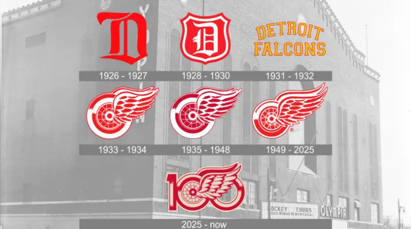
And here’s a great detail most fans don’t know: for decades, the version painted at center ice didn’t always match the one on the sweaters. The logo was so intricate that hand-painting it led to subtle differences.
Still iconic. Still unmistakable.
Some logos age.
This one just exists.
Pop Culture Moment: Ferris Bueller’s Badge of Cool
Few sports logos have had a cooler on-screen cameo than the Winged Wheel in Ferris Bueller’s Day Off. Cameron Frye’s red Red Wings sweater wasn’t accidental — it subtly reinforced the film’s Chicago-Detroit Midwest identity and cemented the logo as a symbol of effortless cool. Decades later, that sweater is still referenced in fashion circles and retro collections.
The Detroit Lions: Honolulu Blue, Tradition, and “Bubbles”
The Lions didn’t start in Detroit — they arrived in 1934, relocating from Portsmouth, Ohio. Owner George A. Richards renamed them to pair with the Tigers, believing the lion should be the king of the NFL jungle.
The color choice came from a player, Glenn Presnell, and his wife. They liked a shade that reminded them of the ocean in Hawaii — and Honolulu Blue was born.
The lion logo itself didn’t arrive until 1961, eventually becoming the filled-in version fans affectionately — and sometimes critically — called “Bubbles.”
Why the nickname?
Because for years, the lion looked less like a predator and more like a circus cat mid-leap.
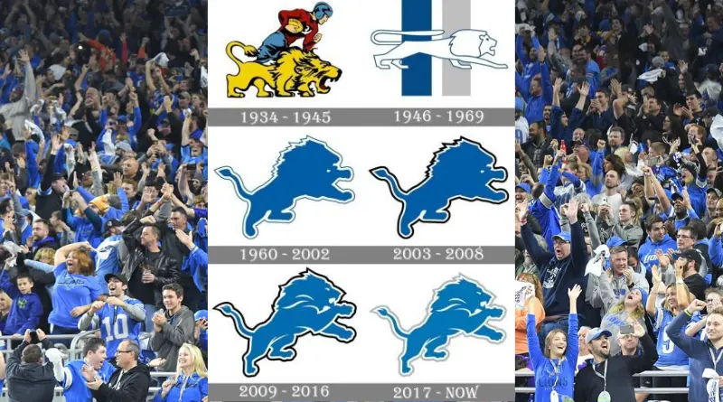
In 2009, the Lions finally modernized it — sharper angles, muscle definition, teeth, a stare that actually looked intimidating. Same lion. New posture.
Detroit accepted it.
Because it still felt like us.
Pop Culture Moment: Hollywood’s Detroit Shortcut
The Lions logo has long been used as visual shorthand for Detroit itself. It appears prominently in Beverly Hills Cop, worn by Eddie Murphy’s Axel Foley as he navigates L.A. with Detroit swagger intact. The logo wasn’t about football — it was about identity. When Hollywood wanted to say “this guy’s from Detroit,” the Lions were the uniform.
The Detroit Pistons: From Tin Men to Teal Horses
The Pistons’ story might be the most Detroit of all.
Originally owned by Fred Zollner, whose company made engine pistons, the team’s earliest logo was literally a robot built of pistons playing basketball.
Industrial. Functional. On brand.
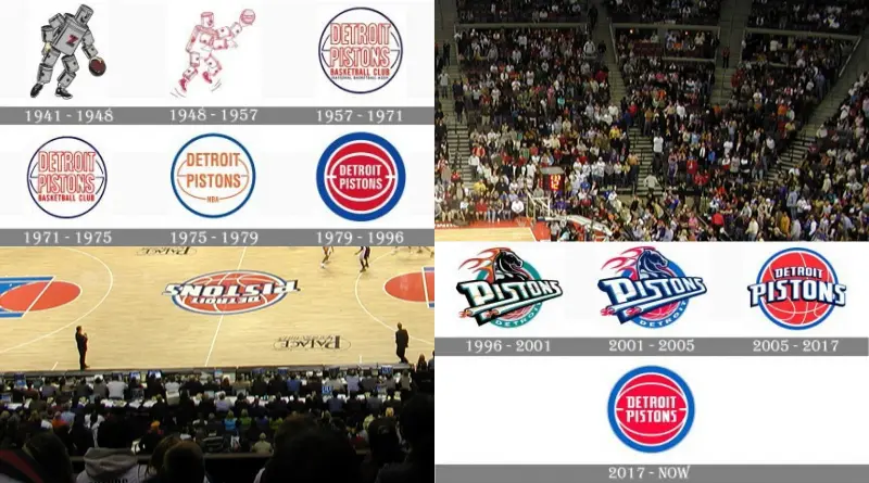
When the team moved to Detroit in 1957, the identity sharpened into the red-white-and-blue basketball that defined the Bad Boys era. Simple. Tough. No nonsense.
Then came the mid-90s.
The NBA wanted flash. Youth. Edge.
So the Pistons rebranded with teal, black, yellow, and red — and the infamous Flaming Horse logo. Traditionalists hated it. It felt cartoonish. Forced.
But here’s the irony.
That generation grew up with it.
Today, teal Pistons gear is everywhere. Vintage. Cool. Reclaimed. What once felt wrong now feels nostalgic — proof that time doesn’t erase identity, it reshapes it.
By 2004, the Pistons returned to red, white, and blue.
And the grit returned with it.
Pop Culture Moment: The Teal Era Finds Redemption
While the classic red-white-and-blue Pistons logo stayed largely within basketball culture, the teal era Pistons found new life years later through hip-hop, streetwear, and nostalgia culture. Artists, influencers, and fashion brands resurrected the flaming horse logo in music videos, photo shoots, and capsule collections. What was once mocked became retro gold — proof that even controversial logos can age into icons.
Why This Matters in Detroit
Other cities rotate logos like fashion trends.
Detroit doesn’t.
Here, logos get earned. They survive eras. They carry scars. They mean something. That’s why changes are debated so fiercely — because these symbols aren’t just on jerseys.
They’re on tattoos.
On garage walls.
On childhood memories that never quite leave.
And that’s why, no matter how many redesigns come and go, Detroit always knows who it is.
Tell us about your favorite logo and why! Drop a comment below!
❤️ Two Ways to Support Independent Michigan Sports Coverage
- Buy Us a Cup of Coffee (or two)!
- Shop MST Merch: Wear the logos — and the stories — that built this state.
All logos shown are the property of their respective teams and leagues and are used here for editorial and historical purposes.